PROJECT / AKTIVKA
The Aktivka brand aims to unlock opportunities for play, engagement, learning, creativity, inquisitiveness, quality growth, progress, and exploration of the rich Croatian heritage and natural beauty. The brand's name embodies the core concept of enriching leisure time by engaging in diverse activities that foster a child's development and education.
It nurtures curiosity for acquiring new knowledge and making discoveries, both about oneself and the surroundings, all while embracing play, problem-solving, navigation, and exploration. The visual identity of the brand characterizes the Aktivka world as modern, inviting, warm, friendly, dynamic, intelligent, educated, and cultured.

The Aktivka logo's design concept is inspired by the brand's name, derived from "activity." This name not only reflects children's playful nature but also invites engagement in various activities offered through its products. The typography conveys the brand's dynamic character, leaning towards illustration in its visual style. Additionally, a complementary graphic element represents key brand values, such as activity, dynamism, playfulness, freedom, creativity, progress, goal achievement, and exploration.
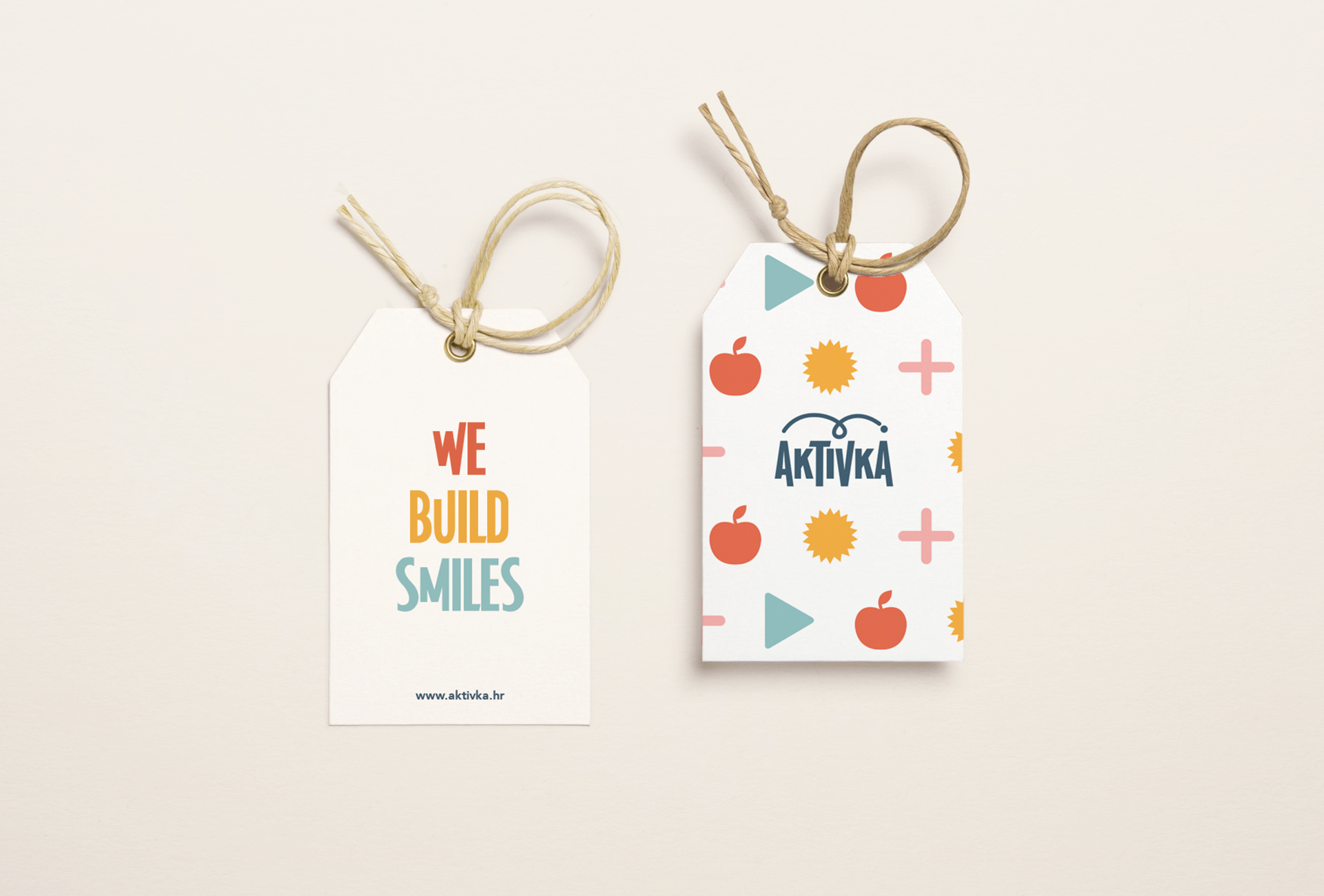
The tagline "We build..." incorporates essential words like "WE" (highlighting community and a shared purpose between the brand and its customers), "BUILD" (representing progress, and growth), and it is followed by a sequence of positively associated terms that reflect the brand's objective. This objective is centered around generating customer satisfaction and creating a fulfilling experience for the user.

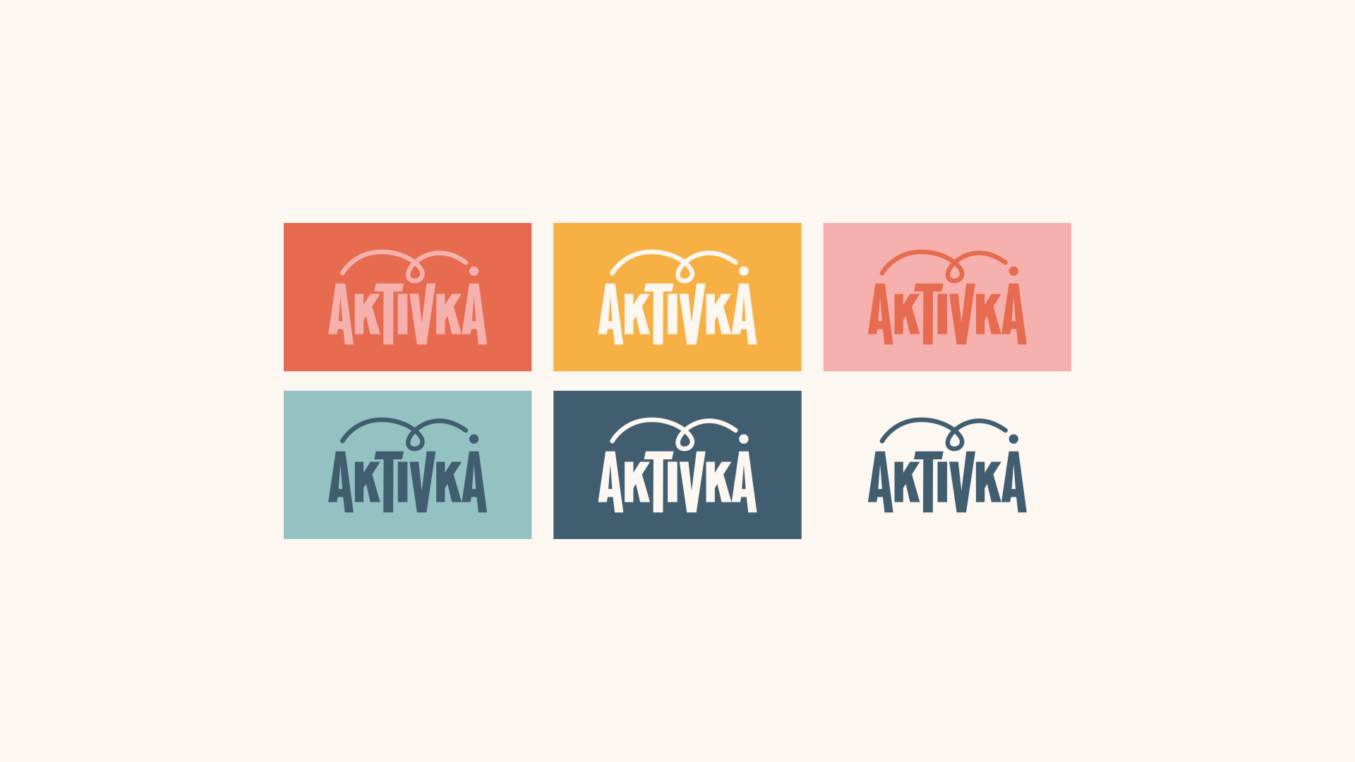
Aktivka's color palette comprises hues that evoke a pleasant, warm, and friendly ambiance, which the brand aims to convey. For this reason, the primary chosen colors are subtly pastel and unobtrusive but give off an impression of liveliness, warmth, cheerfulness, and playfulness. The background "milky" color connects them and contributes to a warmer visual atmosphere. In selecting these colors, care was taken to strike a balance between colors suitable for both girls and boys, ensuring that the brand visually appeals to both groups. By crafting a robust color palette, the brand shapes its personality, making color its primary means of communication and recognition.

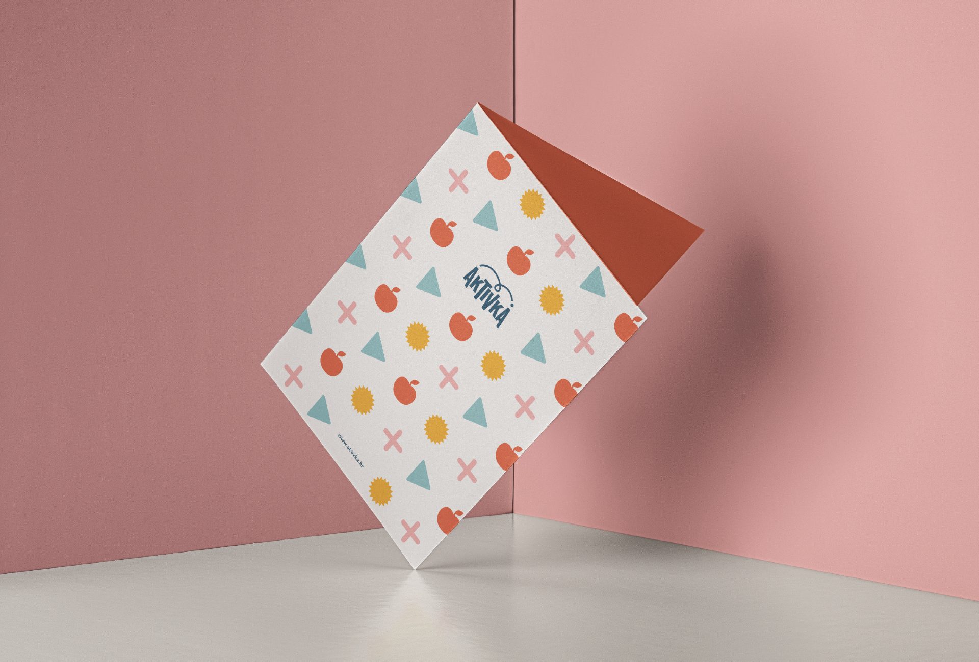
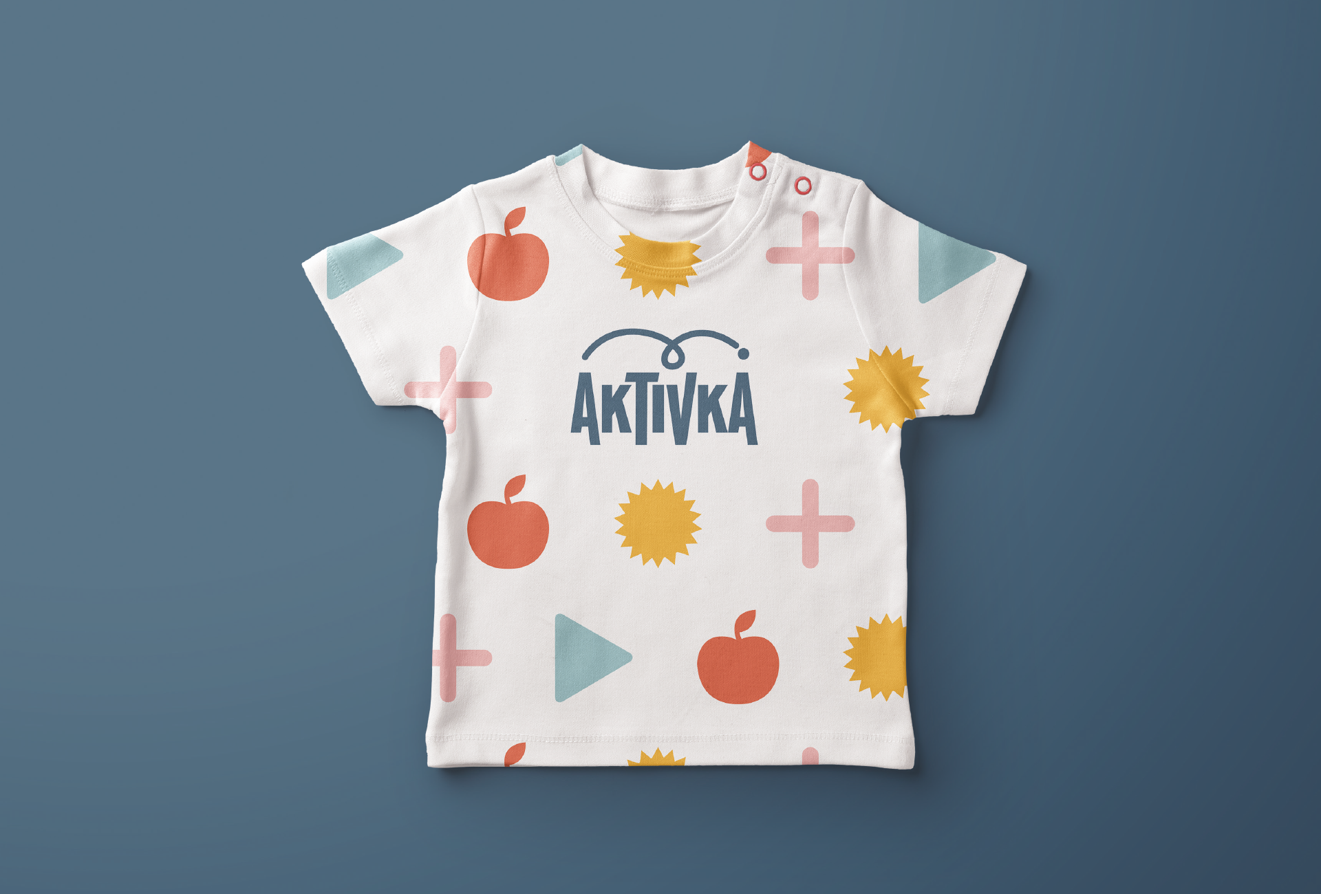
The brand pattern is designed using icons, which function as a universal language understood by all, their meanings and associations remaining clear regardless of linguistic variations. These icons are integrated into the pattern to effectively communicate the core concepts that the brand represents in its communication. Additionally, they emphasize the crucial principle of striking the ideal balance in stimulating activities for a child's development, which lies at the heart of Aktivka and its products.

